
01Observed in text
Homepage title
In this illustrative example, the homepage includes a descriptive title.
Recommended next step
Keep the title specific to the business and its primary service.
DMXReady · Website Intelligence Report
Five homepage text signals, honest evidence limits, and a practical improvement plan. No invented rankings or scores.
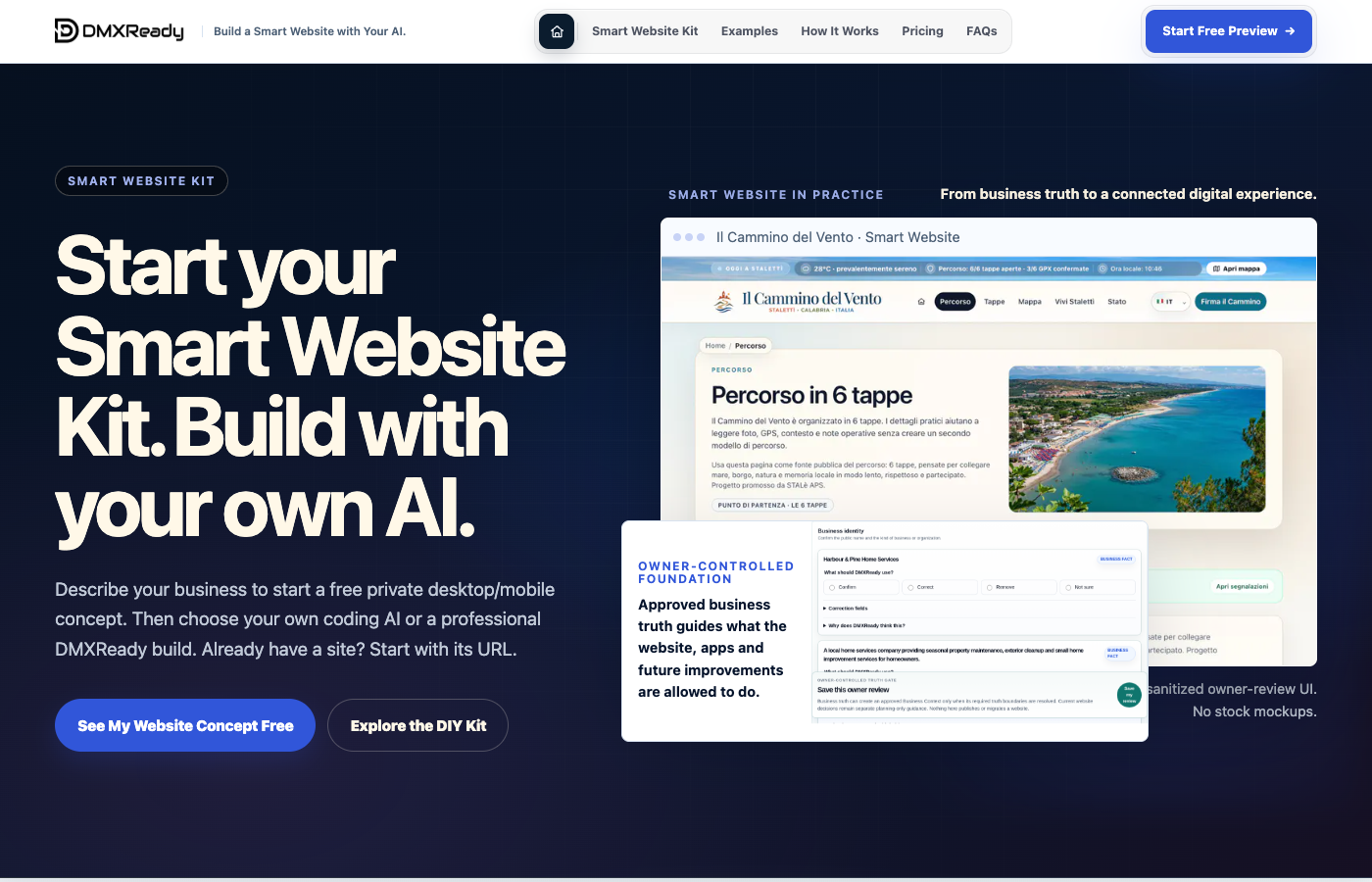
Design example only. The screenshot is a real capture of DMXReady’s homepage, but the annotations and findings are illustrative—not the output of an automated audit.
Five categories, based only on homepage text. This is not a quality score.
“Not observed” does not establish that a feature is absent or broken. This is not a full SEO, performance, accessibility, security or conversion audit.
Homepage snapshot
Real website evidence can be pinned to exact locations. The original screenshot remains unmodified; annotations are a separate layer.
Actual DMXReady homepage screenshot · Callout positions and recommendations are illustrative, not an automated audit.
Annotated homepage
Choose a numbered marker to connect an observation to the part of the homepage it concerns.
This is where we can point to the headline and review whether a visitor quickly understands the offer.
The screenshot is preserved. Annotations are a separate, removable layer and must not be treated as proof of an unverified defect.
Evidence-based review
In this illustrative example, the homepage includes a descriptive title.
Keep the title specific to the business and its primary service.
In this illustration, a clear contact pathway is not established.
Make an enquiry or contact action easy to find and test its form on mobile.
In this example, the homepage introduces the main service.
Explain who benefits, what is delivered, and what makes the offer distinct.
In this illustration, authentic client proof requires review.
Where appropriate, add permissioned testimonials or verifiable portfolio examples.
In this illustration, the most important next action is not yet clear.
Give visitors one strong next step and verify it works on desktop and mobile.
Action plan
Review together
Explore the visual review now. Actual customer screenshots and location-based annotations require separate capture acceptance.